Henri Schaller

Project Lemon - Henri Schaller

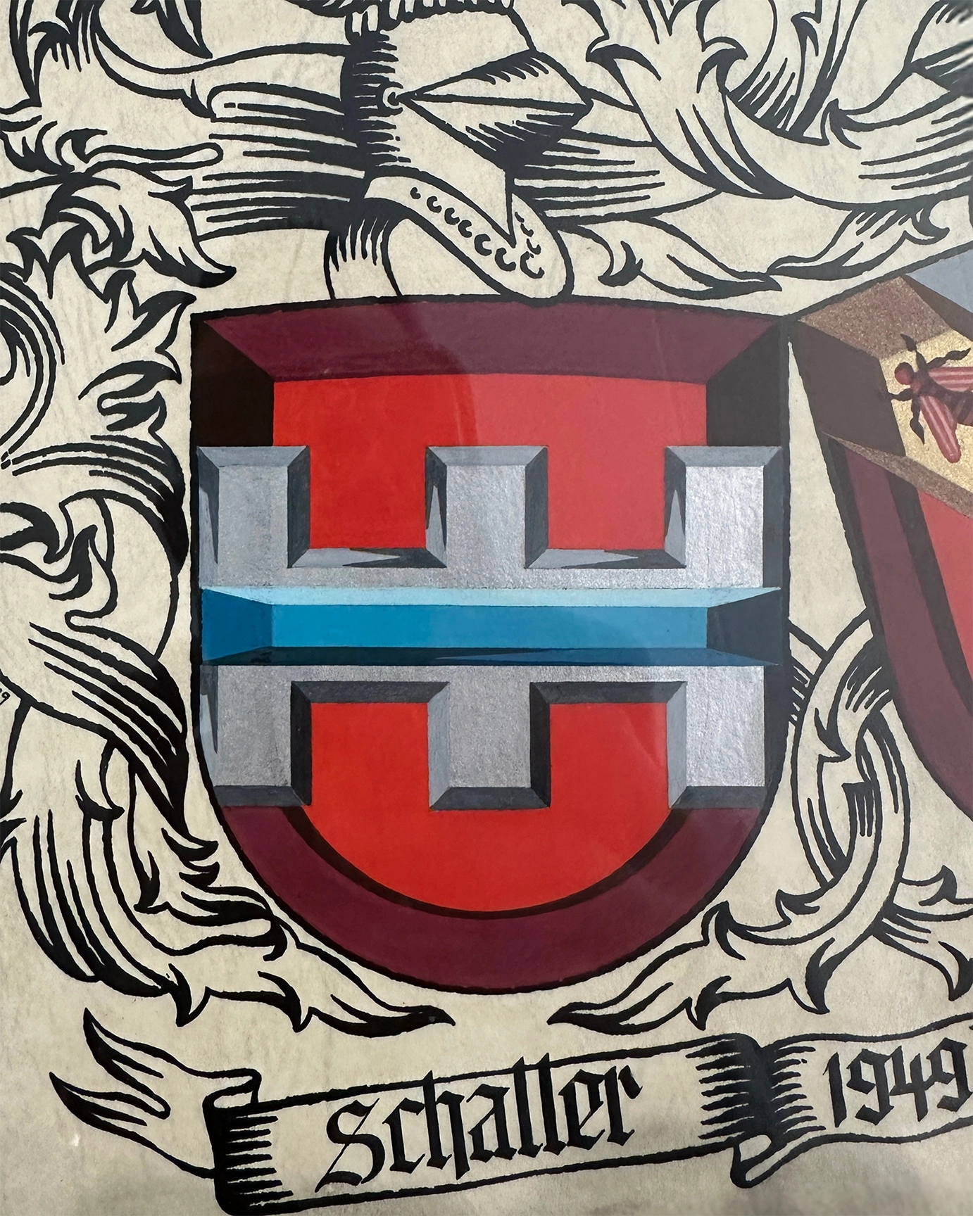
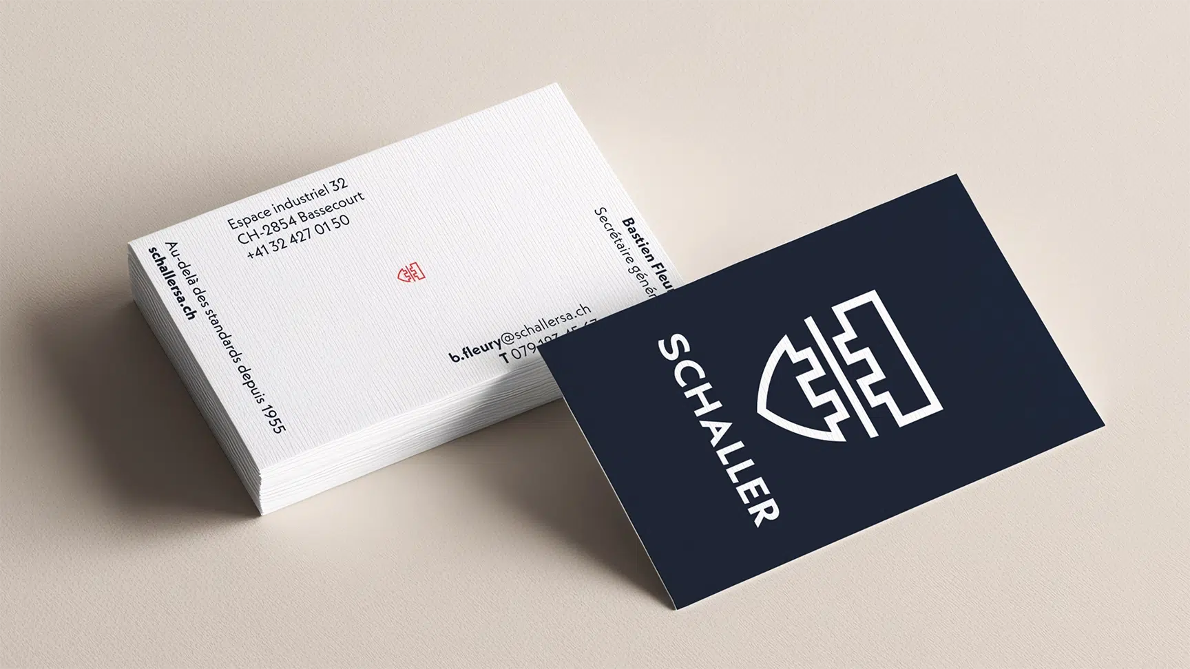
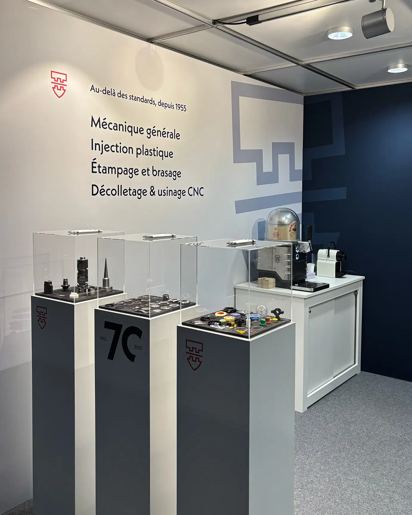
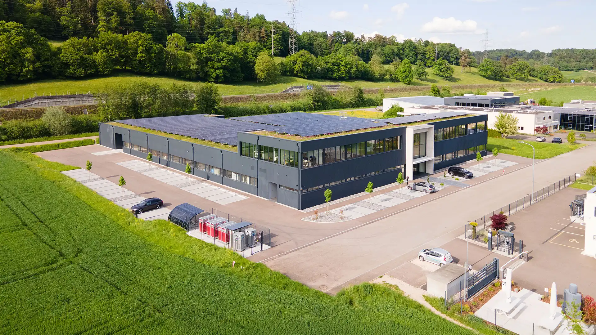
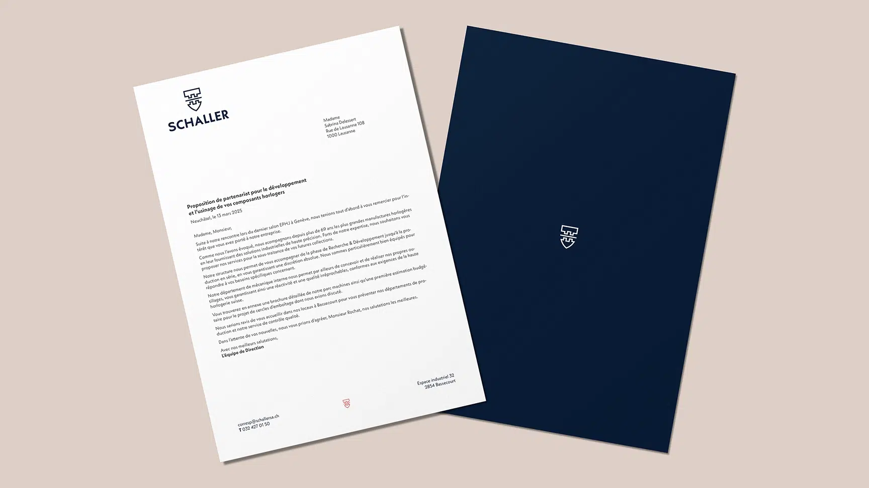
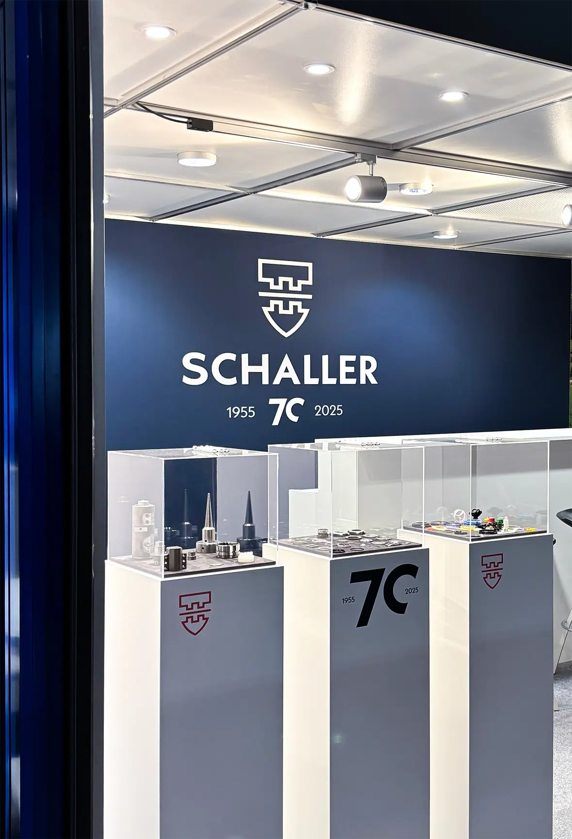
Henri Schaller SA embodies technical expertise passed down through three generations. To mark a new phase in its development, the company sought to modernize its image. The challenge was to create a strong visual identity that honors its family roots while affirming its vision for the future.

What we did

Branding

Booth

Issues

The challenge was to modernize a historic institution without compromising its heritage. The goal was to convey the solidity of a technical “fortress” and the precision of an expert through a clean, innovative visual language.

Solution

Inspired by the family coat of arms, the design features a deep blue that symbolizes precision. The red, a nod to the family’s Swiss and Jura roots, adds a dynamic touch to the overall design. This contrast unites industrial stability with pride in an exceptional region.

 - Henri Schaller
 - Henri Schaller
 - Henri Schaller
 - Henri Schaller
 - Henri Schaller
 - Henri Schaller
 - Henri Schaller
- Henri Schaller
- Henri Schaller
 - Henri Schaller
 - Henri Schaller