A distinctive identity

<p>Une identité de caractère</p> - Lemon

February 14, 2022

Want to give your writing a Neuchâtel accent? Then write it in "Neuchatel regular." A font that we created from scratch, inspired by architectural symbols typical of Neuchâtel.

We undertook this creative project at the request of the authorities in the city of Neuchâtel. After the capital merged with Corcelles-Cormondrèche, Peseux, and Valangin, the new political municipality—now the third largest city in French-speaking Switzerland—was looking for a graphic identity and launched a competition for ideas.

Typographic approach for a logo

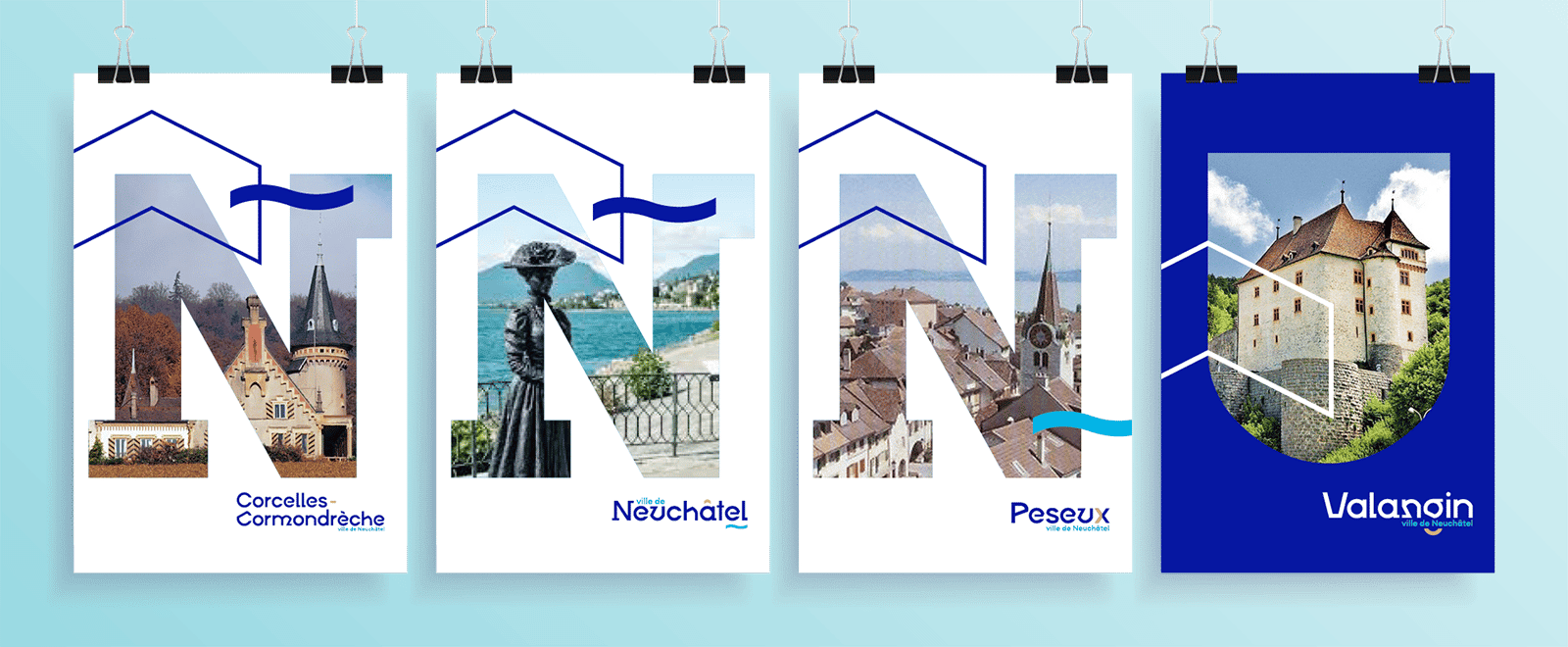
At Lemon, we wanted to develop a concept that stands out from current trends in city graphic identity.

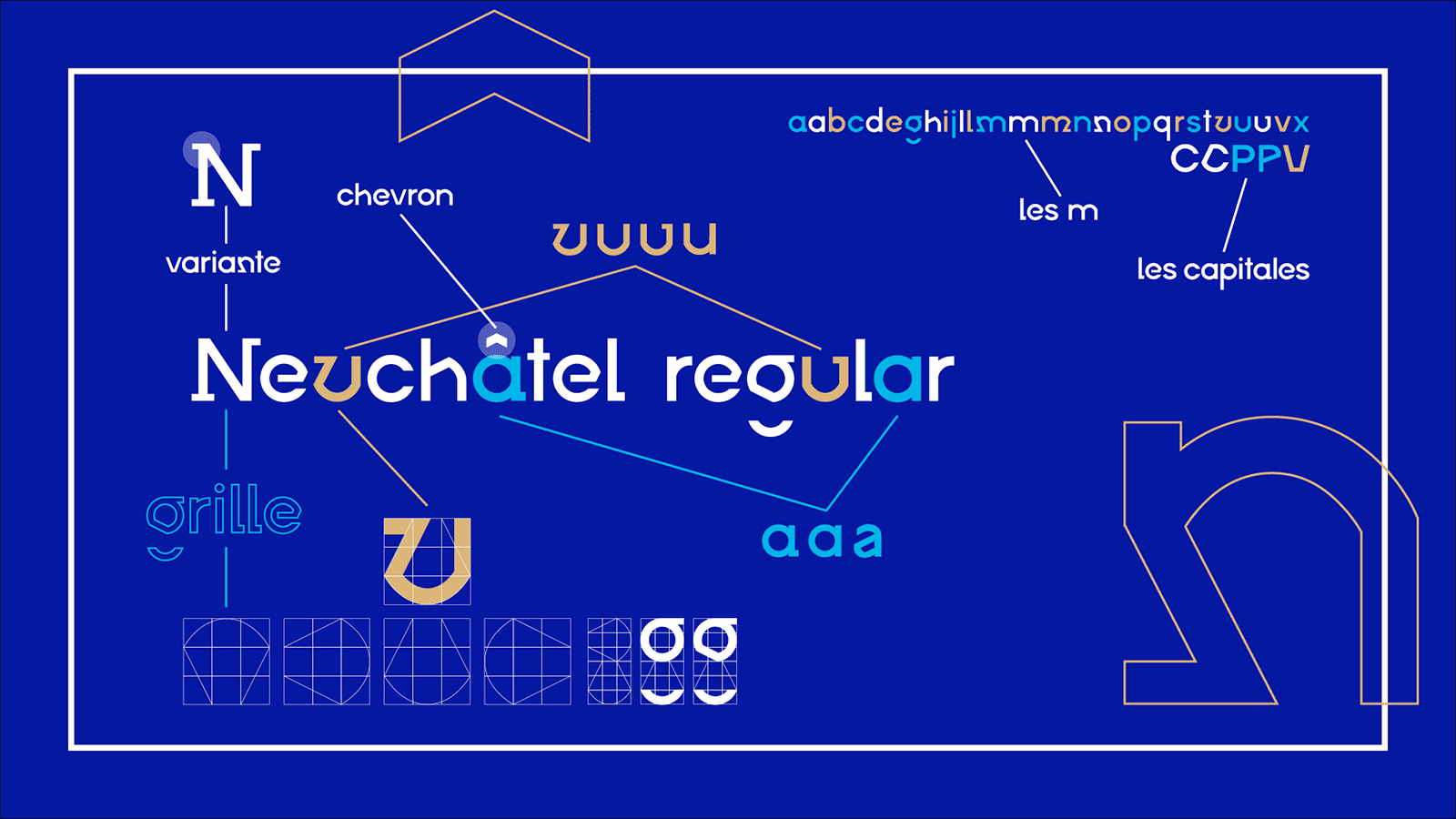
For us, what could be better than a typeface for creating logos or titles for graphic applications such as posters, city signs, or report covers? By using this typographic approach, we also wanted to honor an artistic tradition in the region, exemplified in particular by Jean Mentha, the famous typographer from Neuchâtel.

Our colleague Joëlle is also a typographer and a native of Neuchâtel. She was therefore responsible for giving the Neuchâtel accent to the lettering of "Neuchatel regular." To do this, she drew inspiration from the architecture of the capital of Neuchâtel and its three sister municipalities.

 - Lemon

In search of common elements

When you walk through their historic streets, certain codes and symbols immediately catch your eye. We have identified a few recurring elements:

  • The arches surrounding the entrance doors.
  • Chevrons and waves are often painted on the shutters of old buildings.
  • The stone chains that decorate the corners of winegrowers' houses.
  • And, of course, Hauterive stone, the typical limestone whose ochre yellow color bathes the region.

These refined, stylized elements have been integrated into a typographic grid to give shape to the characters ofNeuchatel Regular. To modernize the rendering, the font is composed of both geometric and typographic glyphs.

 - Lemon

This font is primarily intended for use in headlines and large text. It pairs well with a simple Helvetica font for body text.

As for colors, we proposed using three main colors: dark blue, representing the lake, a powerful symbol of the city; sky blue, symbolizing openness and innovation; and stone yellow, evoking tradition, of course, and the Hauterive stone.

 - Lemon

Symbols

Finally, to support the typography in its various forms, we have developed a series of strong symbols representing the values of the new City of Neuchâtel. They can be used alone, in combination, as a pattern, or as a complement to the logo.

There is an "N" representing the first letter of "Neuchâtel," a dynamic shape that points toward the future; the wave represents the city's essential element, water.

The chevron pattern can be found everywhere, from coats of arms to shutters and engravings, and is present in all municipalities. It evokes the history of Neuchâtel and symbolizes elevation.

And finally, the arch and the coat of arms representing the arches of many buildings in each municipality. The coat of arms symbolizes the union and gathering of municipalities. It is often found above doors or windows.

 - Lemon

There you have it. We thoroughly enjoyed working on this concept, which was particularly close to our hearts, given how much we love our city. We love taking on this kind of challenge, always coming up with original and innovative solutions.

Well, in the end, our project was not selected by the authorities. By a narrow margin, it seems... But for us, the exercise was a success. We are proud of the result and we like it. So, we are going to do something with this font ourselves. To find out what, stay tuned. Because one thing is certain,"Neuchatel regular"will not remain in our drawers.

 - Lemon