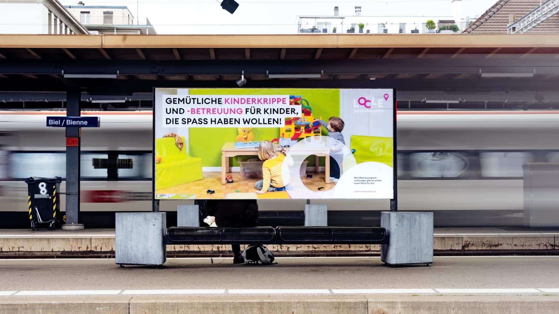
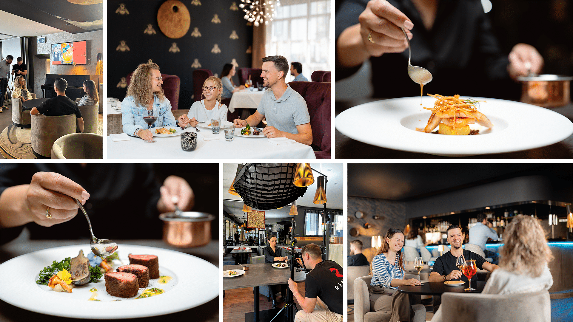
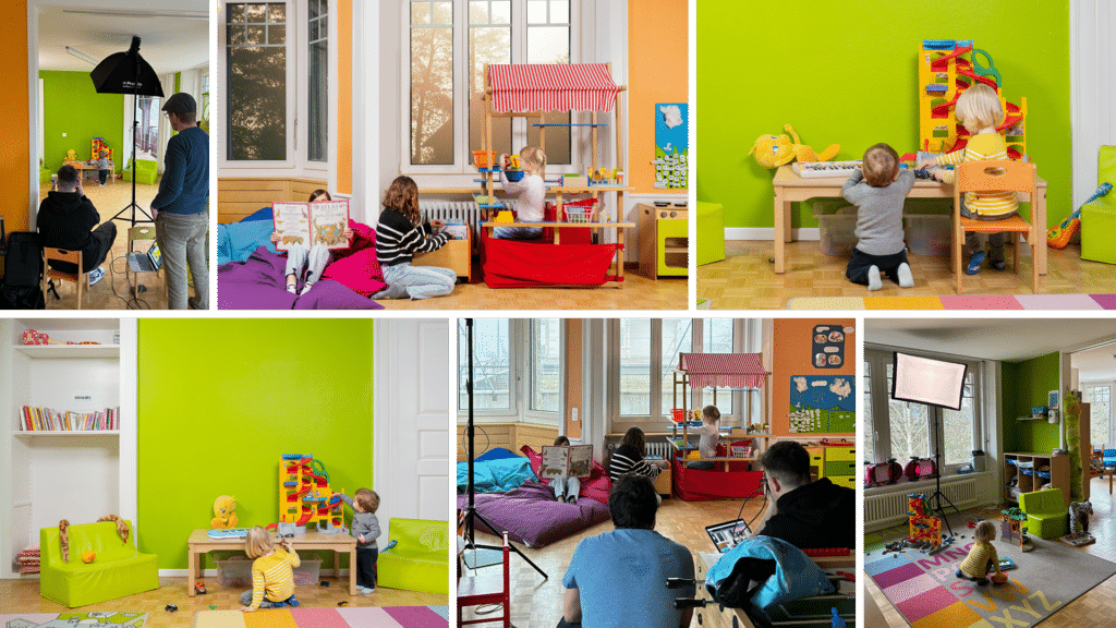
For this assignment, we used our entire range of skills: gentle eyes, a captivating smile, and a charming tone, of course.
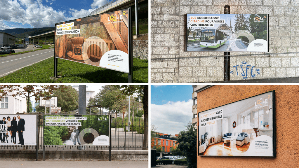
We named this campaign "Le Locle, site de rencontres" (Le Locle, meeting place), in a nod to the town's self-proclamation as the capital of... Valentine's Day. We had to comb through a few dating sites to make sure we got the tone right. The goal? To attract not only new residents, but alsoloversof Mother Earth. The word "site" refers both to the town and its dedicated website, while the "S" in "encounters" highlights the diversity that Le Locle has to offer: modern infrastructure, an unparalleled quality of life, and a rich cultural heritage.
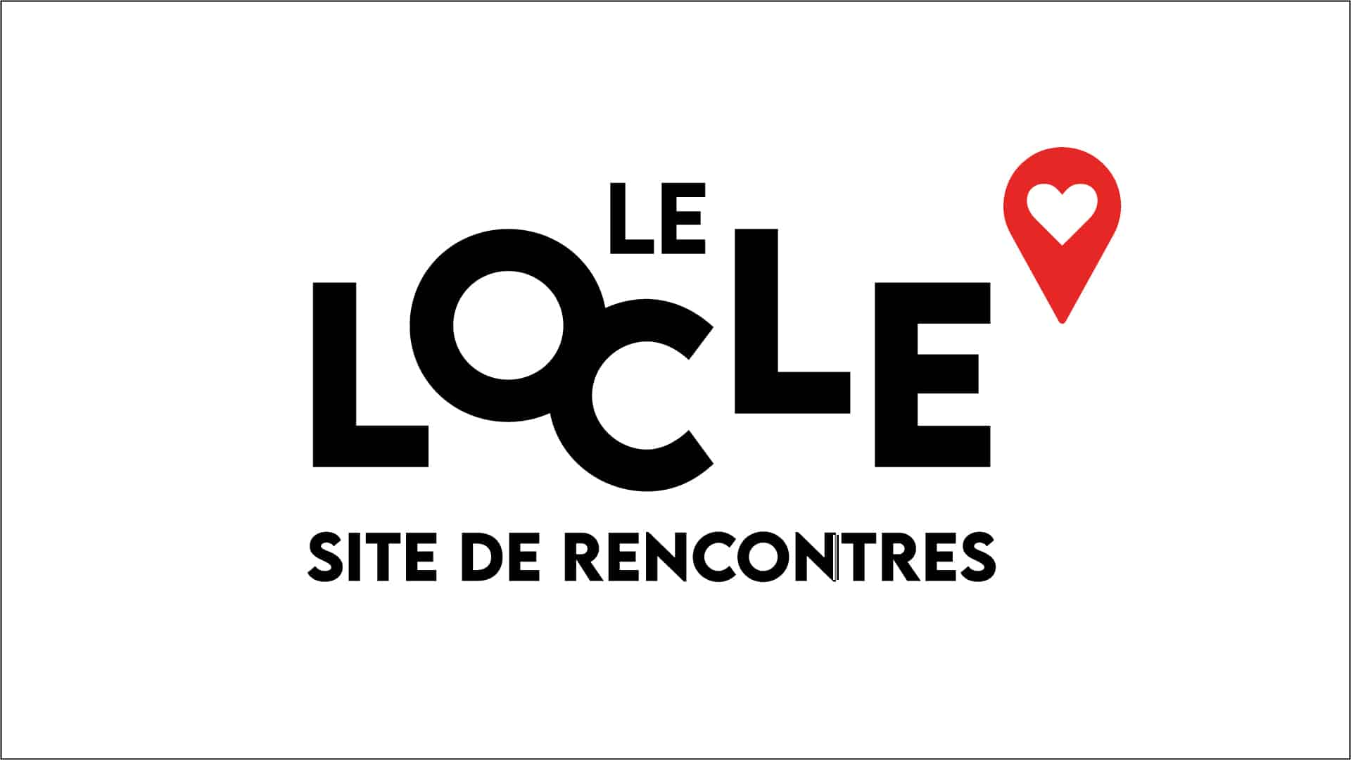
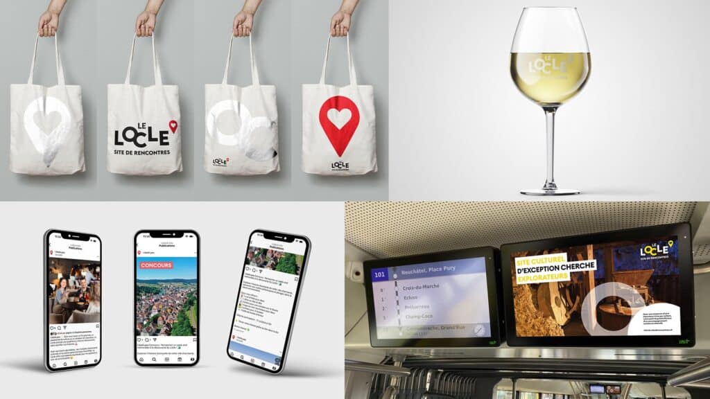
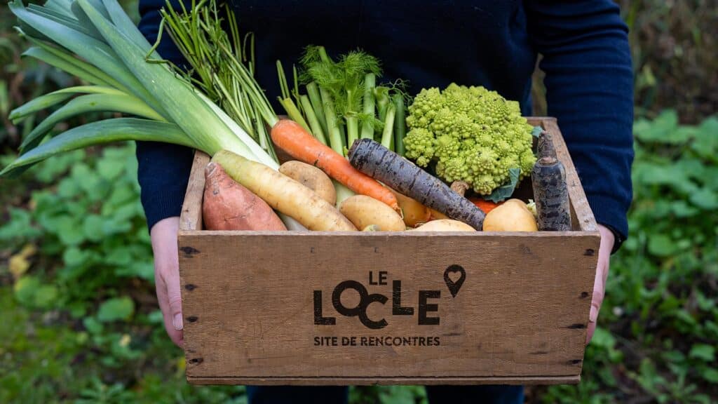
Visually, we opted for a strong identity, symbolized by red, the color of passion. This red is associated with a sleek logo, where a heart-shaped GPS pin reinforces the idea of encounter and attachment.
In terms of artistic direction, we supervised every detail during the photo shoots. And to guarantee authenticity, all the images used in this project are 100% local. No generic photos, only original content captured on site.